
An Illustrators Evolution
“When I was in High School, a friend of mine worked in an architect’s office, and upon leaving that job, he took with him a set of koh-i-noor pens, the full set and brand new. He knew I was an artist and gave the set to me. When I began using these pens, I found that stippling was a good way to produce midtones and shading. That’s how I got started.” -Kevin Sprouls
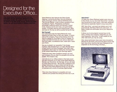
After art school, I was hired as a freelance graphic design novice, at Dow Jones & Co., parent company of the Wall Street Journal (thanks to a friend from school who recommended me). I spent 2 years doing that, and in the process got to know some of the newspaper people at the journal. The front page editor tried me out on a few portraits, as I was more convenient than the guy they were using in S. Carolina (he used a soft pencil on coquille board technique). So, over a period of several months, I developed and consolidated the wsj technique as it is today. All of us dotters, or stipple artists, have different looks and levels of quality. I understand that the wsj folks nowadays draw on thin paper over light boxes to produce their finished works. Something I would never do! My standard process is to trace the image onto board, then ink it, while constantly referring to the photographic image.
EARLY YEARS
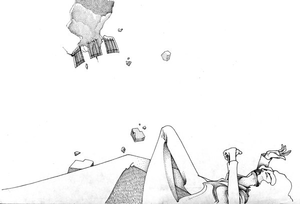
Those pens put me in the graphic direction I’ve been following since teenage years. Here is a drawing, circa 1974 (1st year of art school.)
This is the earliest art sample of mine I could find (I’m sure there are more, somewhere ’round here. Will post when I find them.) I was educated at Tyler School of Art (BFA) Here are a few more from those school days…

Check out that fancy signature… from 1975.

This is from 1976, part of a collection illustrating poetry by my close friend, Mick Tuccillo.
A VISIT TO ROME
In my last year at Tyler, I elected to attend classes during the Fall semester at the school’s extension program in Rome. It was a fabulous opportunity/experience. We students were required to take Italian language classes every day, and I studied Printmaking, Sculpture, Archaeology, and Classical Literature. I especially enjoyed being the student and colleague of sculptor John Shahn. John was a fabulous talent in clay modeling and bronze casting. I discovered a personal skill in modeling from life, and I intend, one day, to return to the art. Here is a rare photo of me in the studio from that time, with my subject (who displays his study of yours truly)…

Studying the classic books with Professor Robeson was also a highlight. I especially relished reading The Metamorphosis, of Ovid. It was a class of only a dozen students, maybe less, but it was always mentally invigorating and a session of lively interaction. If I recall correctly, we ran through a few Greek tragedies, and also studied the Odyssey of Homer. The cool thing about the program in those days is that we students frequently socialized with our professors. I recall getting myself involved with Prof. Robeson and one of her colleagues in a very heated, yet strictly intellectual discussion one evening about words and how they are used to restrict women’s freedoms. It was friendly, and we were all on the same side, but I believe I got my comeuppance in spades that night!
Rome continues to exert its influence on me. I found it a haunting city, equally possessed of beauty and terror. It feels as if there are many ghosts still lingering from the various periods of its development. The school was a welcome refuge from Rome’s frenetic energy, and the students were bright and talented. We were indeed running on a rich mixture of historical sensory-bombardment and artistic aspiration. Not to say there weren’t challenges… but the comradery of my colleagues, and the significant cultural stimuli I was taking on board brought me beyond my self-absorption, and afforded me a deeper appreciation of the world around me.

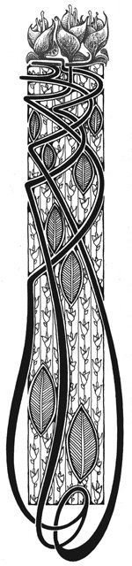
My last semester at Tyler, in 1977, I wrote a short book and produced illustrations for it. Here is one of 6 images I produced, and a decorative border that was designed to flank each page:
I kind of like the border, but I lost control of the flowers on top of the design. Someday I’ll get around to doing it over, to get the top right!
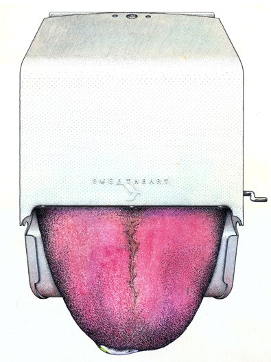
This one is from my Junior-year Illustration class, taught by a really decent guy named William Woods (Woody). I studied (worked!) under Woody for 2 or 3 semesters. He was a positive player in my development as an illustrator. The assignment was to take an inanimate object and humanize it. This is what I came up with:
(This image appeared in Advertising Age as part of a profile piece about the Wall Street Journal illustrators.)
…. so much for art school years.
POST-GRADUATE YEARS, THE START OF MY PROFESSIONAL CAREER
The September after graduation, 1977, I received a call from an A/D in New York who asked me to come in to show my work. That was a brilliant man (and an elegant live wire) named Dick Martell. He was put onto me by my old roommate from school, Kevin Harrington (Thanks, Kev!)
So, I spent 2 years as a freelance Graphic Design guy, doing the occasional illustration, if I could get it. This was at Dow Jones & Co., parent company of the Wall Street Journal. Although the pay was fair, it was pretty ordinary work. Here are two pieces I designed, one with my illustration:
As you can see, Helvetica (the typeface) was new and sexy at the time, and we paid a lot of attention to tight letterspacing! I was also doing various extracurricular projects, etc. Of those I still have, here are a few:

Business card image for a house painter friend
Whilst seeking employment, I created a whimsical calling card/promo (also produced @ “Sir Speedy”). This is the illustration from it.
This is an (abstract, for some) image I had produced as a holiday card, circa, 1978. I handcrafted the type. Three color process printing: red/tan/black. This would have been printed @ “Sir Speedy” Caldwell, NJ, on coated stock.
BECOMING A CONTRIBUTOR TO THE WALL STREET JOURNAL
In those days, we worked in a moderately sized building at 22 Cortlandt St. (next to Century 21). We in the Marketing department were on the 4th floor, and the newspaper operation was on floor 6.

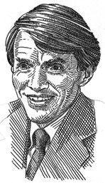
Here is one of (I believe) Paul Volker:
The cafeteria was on the 5th. So, we would be rubbing elbows with the Journal editors and reporters on a regular basis. A very nice person, Glynn Mapes, was the page one editor at that time, and I suppose I mentioned my interest to him in trying to produce a portrait for the paper. Well, he tried me out.
At the time (1979), the Journal was using a very few portraits per week in the publication, produced by someone who I believe was located in S. Carolina. He worked on a pebbly-surfaced board with either a very soft pencil or grease pencil. To begin with, I tried that technique.
Another try didn’t quite hit it (the original of this one is small, about 3.5″ high:
Check out the vintage cardboard and masking tape. The number on the bottom is for the camera people who would make photostats down to the print size. These “stats” were normally shipped out to the main printing plants throughout the country via the daily “pouch”.

Henry Ford, Jr. I believe. I was onto something…
Pretty crude, but I think it was published. The next one really marks the initial evolutionary step towards the style as it stands today (we’re still in 1979 here):