
Classic WSJ Art, part 24
( To view the initial Post in this series, please click on https://www.sprouls.com/ink-rhythm-blog/classic-wall-street-journal-art )
Continuing the series, here’s a nice portrait I created…
WSJ Hedcut
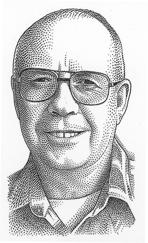
I love to get a photo to work from with good lighting, like this one. Mind you, this printed at width of less than 1-¼ inches in The Journal. I liked it well enough to sign it — bottom-left. The subject was Chuck Sanders (related to Bernie??)
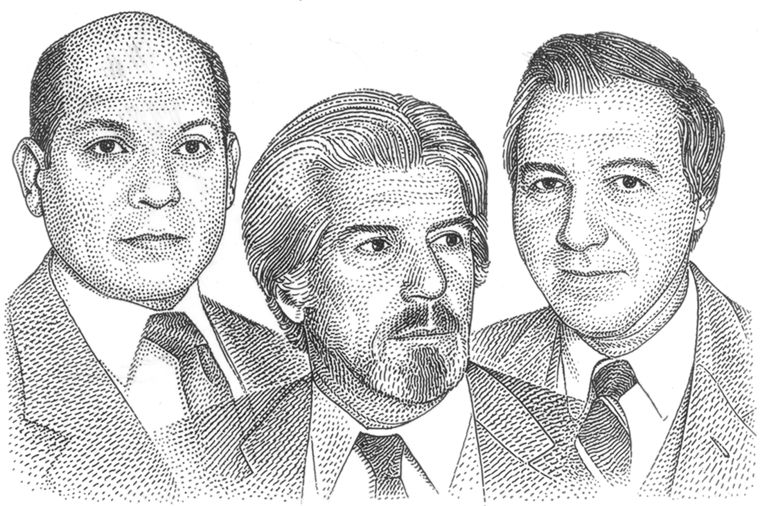
It was always a challenge to combine subjects into a composition. This one was pretty well-handled by using a transparency effect in the drawing. The art was called “Detectives”.
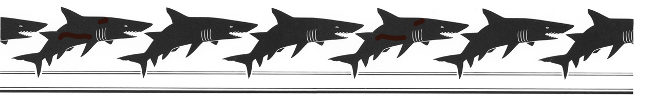
I created the above ‘Frieze’ or banner for a story called “Meetings” Not the sort I would like to attend! This would have appeared in Section Two.
Now in the Olympic Year, let’s remember an Olympian: The Volley Ball champ Flo Hyman…
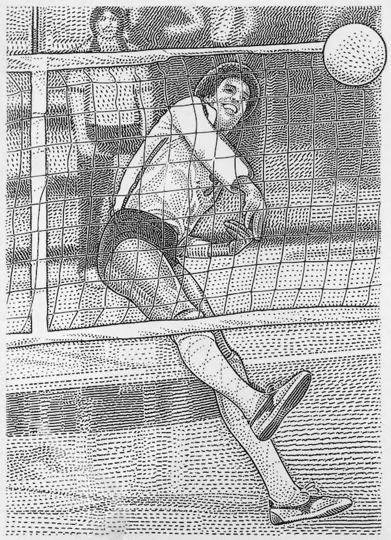
In this illustration, I was trying to achieve a depth-of-field effect, keeping the closer visual imagery very sharp, while diffusing the background details.
Lastly, a commentary on politics…
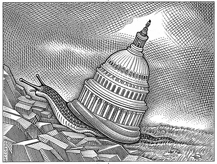
This illustration ran in Section Two in The Wall Street Journal, in a time when things ran very slowly congress. Some very interesting rendering with cross-hatch techniques can be observed. Looks like a rocky road ahead, then as now.
More next week…